Boeing
Brand design for Learn@Boeing
Our role
1. Branding
2. Animation
3. Iconography
In a nutshell
Crafting a streamlined visual identity and marketing materials to unify Boeing's learning and education programs
Challenge
Learn@Boeing is an internal education platform for employees aimed at changing the way they learn, lead, and work at Boeing. The platform provides education in a number of areas, including digital education, leadership development, and more.
The client recognized that each of their existing programs were visually disjointed from one another. They approached the All Purpose team to unify each of these different learning segments through marketing materials and a more streamlined visual identity overall.
A tight time constraint was placed on the All Purpose team, with a turnaround goal being just shy of two weeks. This meant the team had to be efficient with learning how to apply Boeing’s visual guidelines and producing polished branding designs and clean animations.
Branding Rationale
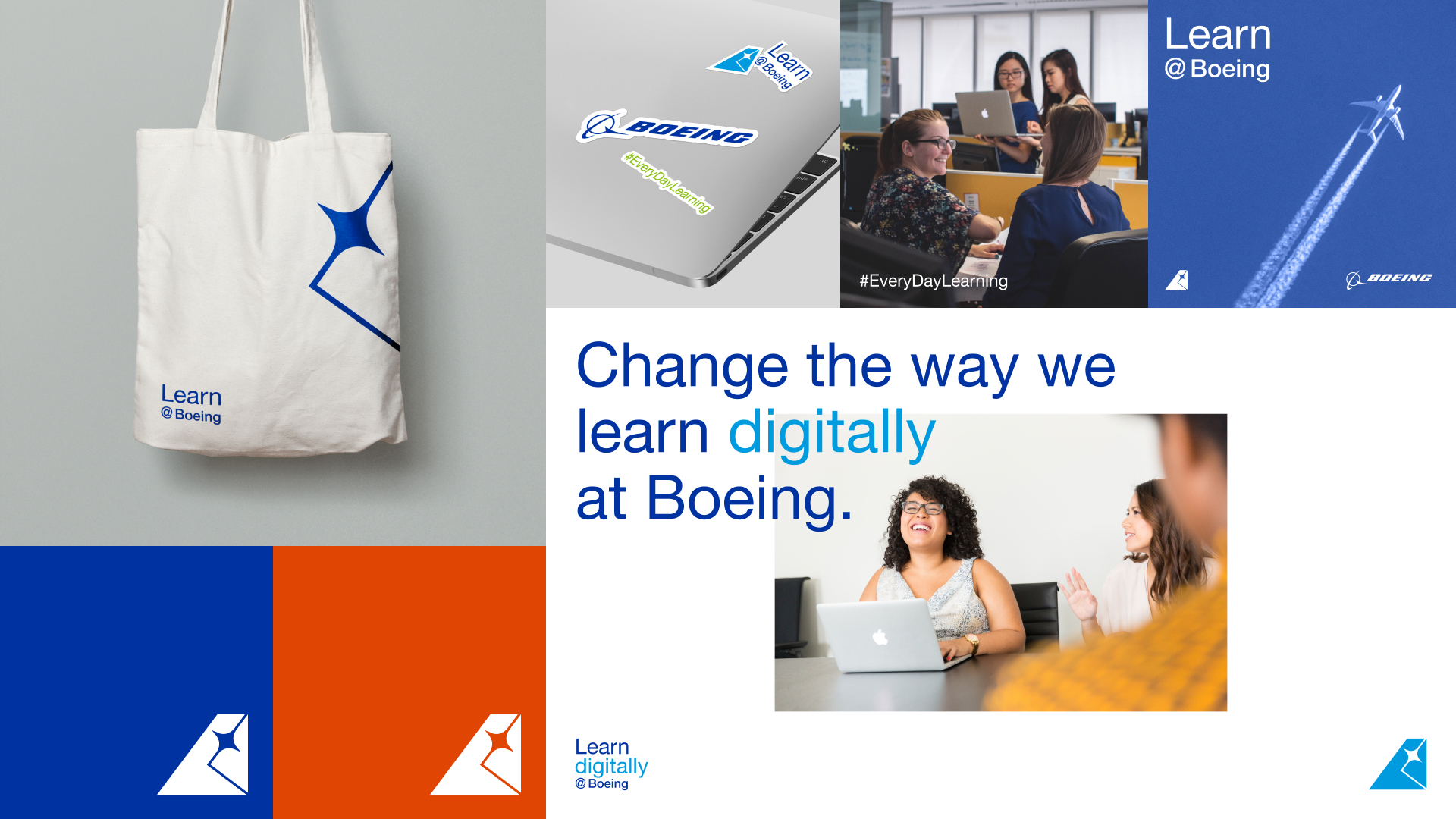
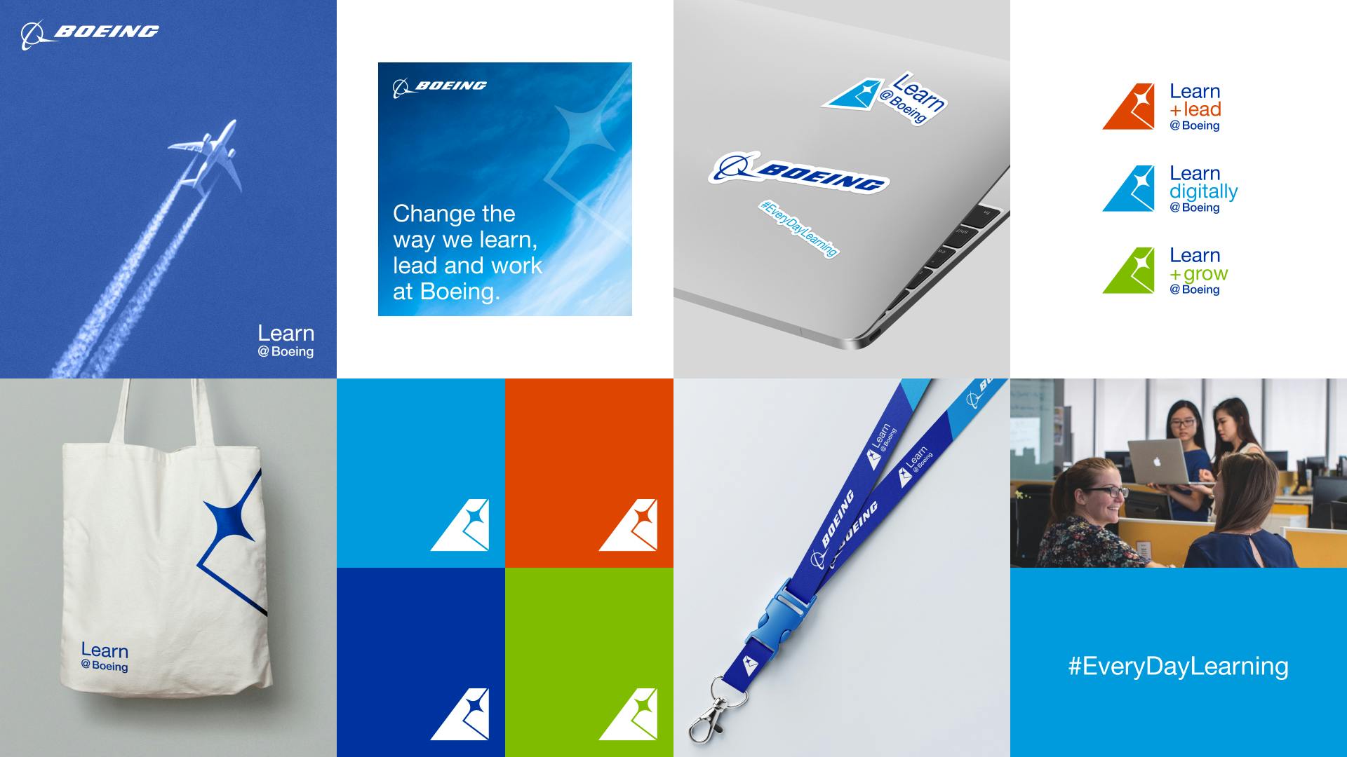
In terms of branding, the AP team focused on systemizing assets and applying them to different visual use cases, like merchandise, posters, email signatures, and more. It was important to codify how to apply assets, like spacing or colour use, to each scenario for future use beyond All Purpose’s involvement. This facilitated Boeing marketing teams to be autonomous with their materials.
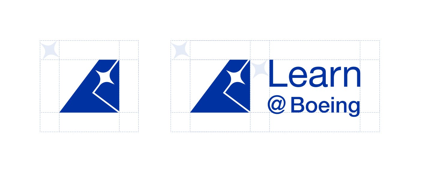
There were a number of iterations that were explored for the Boeing Learning logo mark. The final version features a spark, an ‘L’, and is in the shape of a plane’s tail.
The spark represents ideas and knowledge and is angled upwards, representing growth and development. A subtle design choice was the upward path being in the shape of an L, for Learn@Boeing. The path has a 37-degree angle, which is one of the Boeing brand identity’s principles.
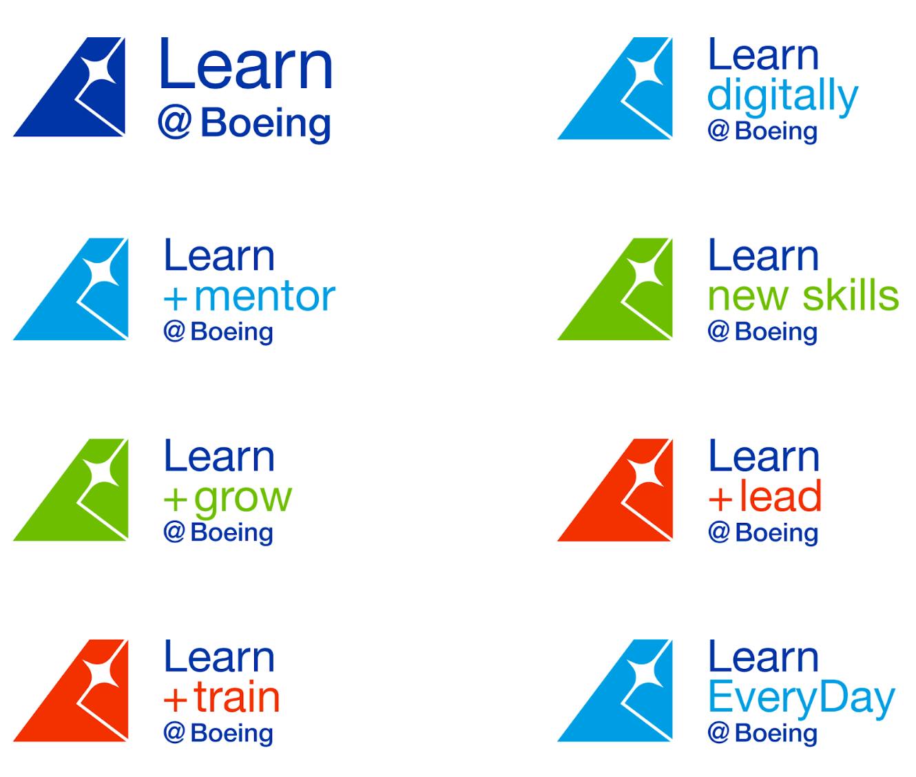
Consistency & Curiosity
One of the main goals of the logo mark was for it to be applied to each of the learning programs available to Boeing employees. Consistency across each platform was particularly important as it would help indicate that each program was unified under Learn @ Boeing.
Overall, the aim was not for the graphic to be too literal, or say too much. The main goal was to keep it aligned with Boeing brand standards but distinctive for the Learn@Boeing program itself.
Outcome
Once All Purpose successfully rebranded the Boeing Learning assets, the client was able to confidently apply this full package of assets to support their upcoming launch for their Learning and Development campaign.